PT Connect

PT Connect
Helping patients find the best physical therapists in their area
This project centered around developing a digital solution catering to physical therapy patients in the US seeking nearby therapists tailored to their specific needs. The outcome was a robust native application, enabling users to generate personalized recommendation notifications by selecting their preferences.
Scope: Case Study and Mid-Fidelity Prototype
Role: UX/UI Design Strategy, UX Research
Duration: 3 Weeks
Tools: Figma, Adobe Photoshop
Designed for: Apple iOS
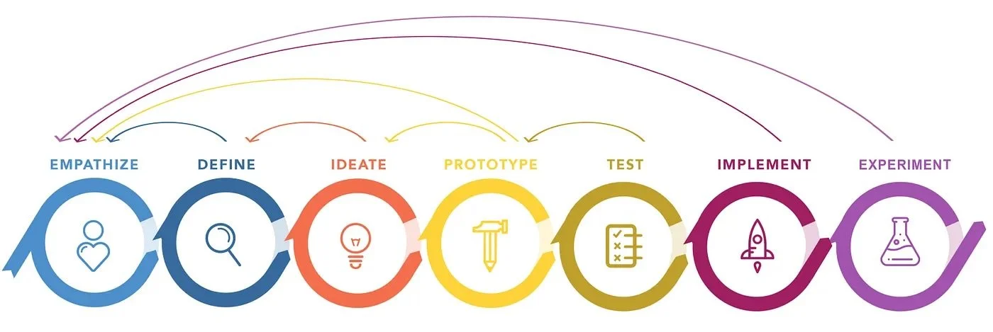
METHODOLOGY
I used the agile design process rooted in thorough research and maintaining a user-centric approach.
STEP 1: EMPATHIZE
THE PROBLEM
Seeking physical therapy care can be an intimidating and confusing process. Without comprehensive guidance, patients find it difficult to know how and where to access the appropriate care. This leads to delays in care that can extend treatment times and result in poorer end results for patients.
68%
of patients with direct access to physical therapy had resolution of their symptoms without further medical referrals or interventions.
60%
of patients reporting that concerns about reimbursement were among the biggest barriers to increased care by physical therapists.
51%
higher medical bills for patients who waited 30 days or more for physical therapy treatment.
From here, I asked
How might we help patients feel more confident in recommendations of physical therapy specialists so they can feel assured and receive care quickly?
Talking to Patients
To gain deeper insights, I conducted open-ended interviews with 3 of the physical therapy patients who had received physical therapy in the US.
The interview questions were designed to delve into participants' behaviors, pain points, goals, and motivations within their experience of getting physical therapy care. The insights gathered from a combination of primary and secondary research were instrumental in crafting a persona and steering the iterative solution process.
From the interviews, I found that all patients refer to physical therapy as PT. I will use this acronym going forward
I also identified three themes that were consistent amongst the users.
Insurance
Insurance causes tremendous roadblocks for patients. From transparency around benefits, prescribed treatment plan coverage, to confusion in language nuance and accessibility. These pain points cause patients to skip treatment altogether or at the least, seriously delays treatment.
Recommendations
Patients overwhelmingly found practitioners via word of mouth recommendations. The personalized recommendation gave them a sense of confidence that the therapist will be able to address their specific needs..
Local Practitioners
Patients often are often grappling with location issues. They face roadblocks if they receive treatment in a state outside of their resident state, or if they are unable to travel long distances to receive treatment from a specific facility. They crave a convenient way to find the right care nearest to them.
CHOSEN THEME
Recommendations
“I relied on word of mouth recommendations because I felt like I could not trust random reviews online. How would I know that practitioner would be able to address my specific needs?
Interviewee #1
After conducting primary research I revised my How Might We….
How might we help patients feel more CONFIDENT IN RECOMMENDATIONS of physical therapy specialists so they can feel assured and receive care quickly?
STEP 2: DEFINE
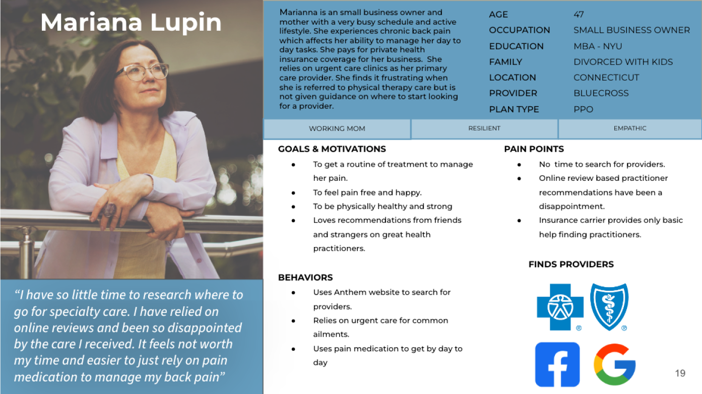
PERSONA
Combining the primary and secondary research findings with the themes uncovered, I crafted a persona aimed to inform the digital solution development process. This persona became a crucial tool, enabling me to empathize with the individuals for whom I was designing the product and served as my guiding principle throughout the entire design phase.
STEP 3: IDEATE
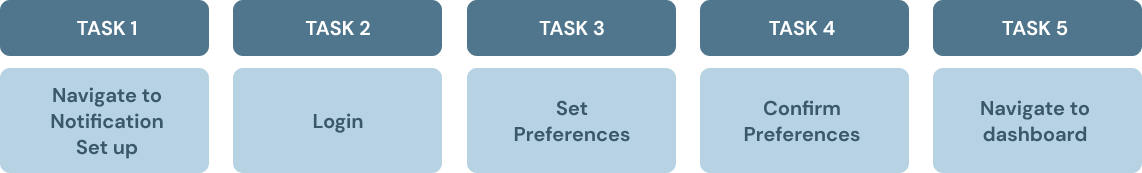
SELECTING A TASK
After shaping the persona, I delved into the creation of over 30 user stories. This excise wasn't just about exploring the potential features of my app; it was a meticulous effort to ensure I was truly meeting the user's needs. My primary emphasis was on refining the process of getting quality recommendations, recognizing the patients need to feel confident in the recommendations they receive.
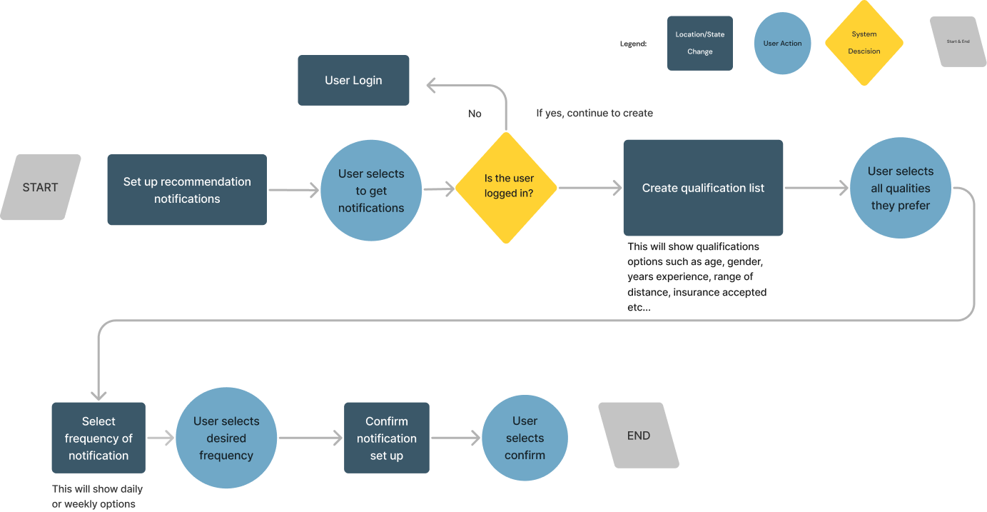
After analyzing the user stories I created based on my persona, and considering the essence of my app's minimum viable product (MVP) and aligning it with my How Might We Statement, I created a task flow based on a patient creating a personalized recommendation list of desired qualifications and practitioner qualities, which is then sent to them either daily or weekly.
This choice laid the groundwork for constructing the task flow that followed.
CORE EPIC
Search for Providers
Task: create a personalized recommendation list based on selected preferences.
UI INSPIRATION
VISUAL LANGUAGE
First, I gathered UI inspiration components from existing travel and search products. I looked for sleek and modern designs that had largely back and white color scheme with a splash of color.
Based on my task flow I searched components that included an effective dashboard and user inputs. Based on my research users wanted to be able to create notification based on personal preferences and needs.
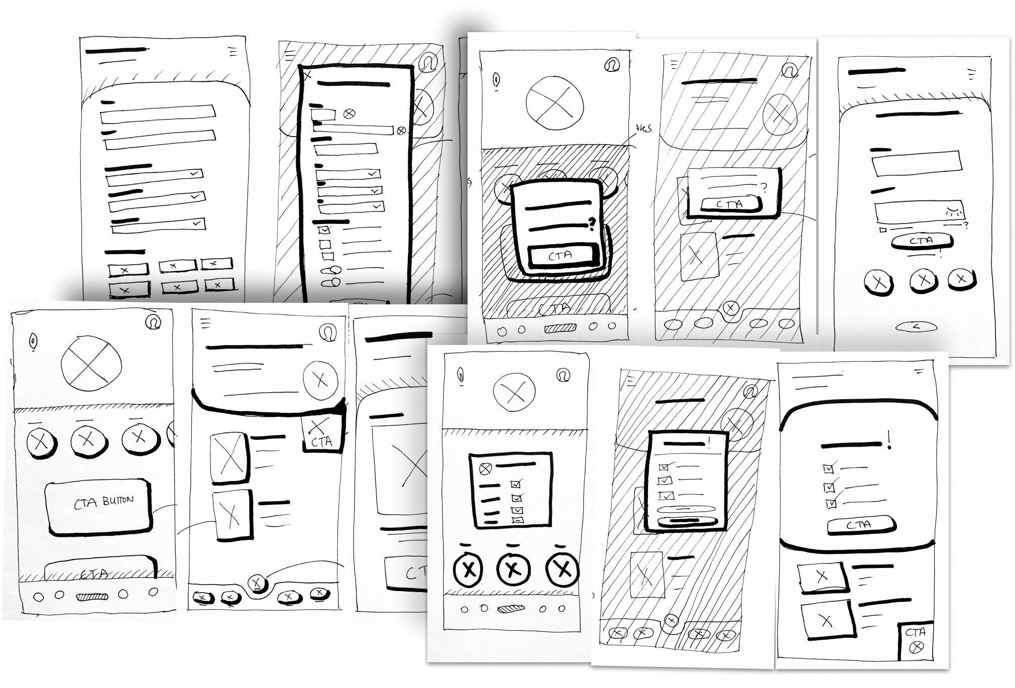
SKETCHING
I began by sketching out the different iterations of the pages by hand and I took my time to figure out which ideas matched what my users really needed. Then I translated the most promising elements into solution sketches that became the starting point for building my wireframes.
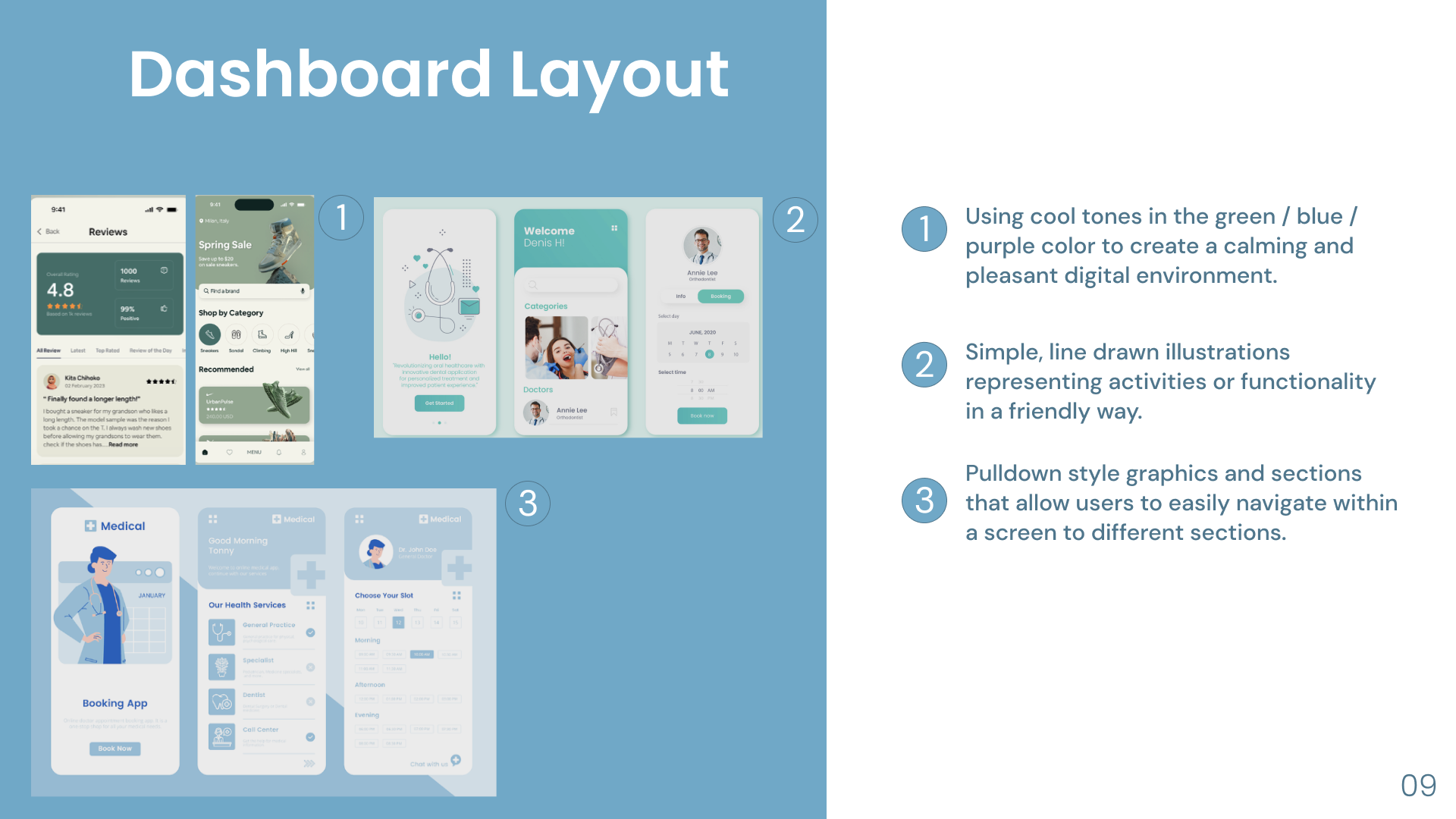
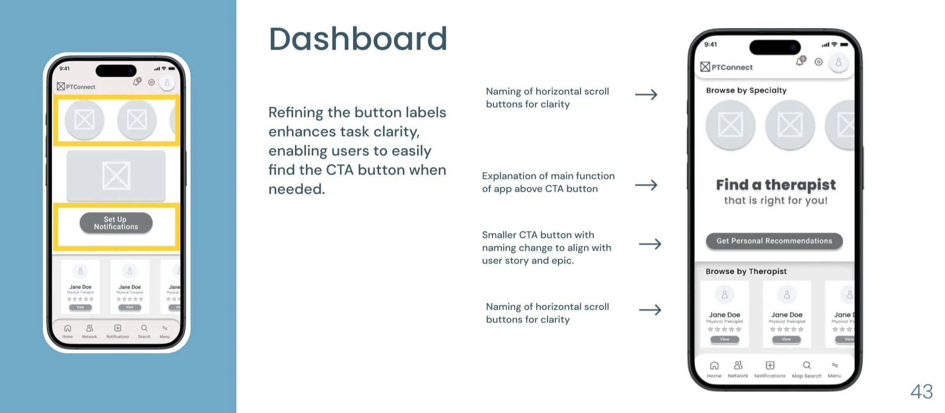
DASHBOARD
User Benefit:
The dashboard is thoughtfully designed with multiple viewing options, allowing users to access information in a variety of formats. We've incorporated recommendation notification calls to action (CTA buttons) in several ways, as detailed below.
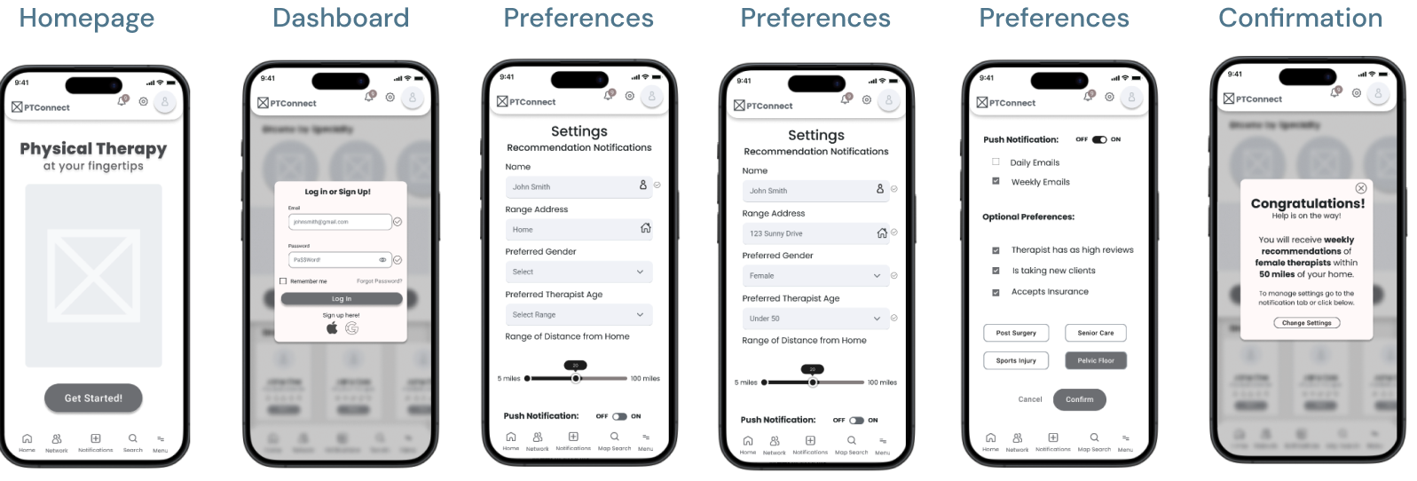
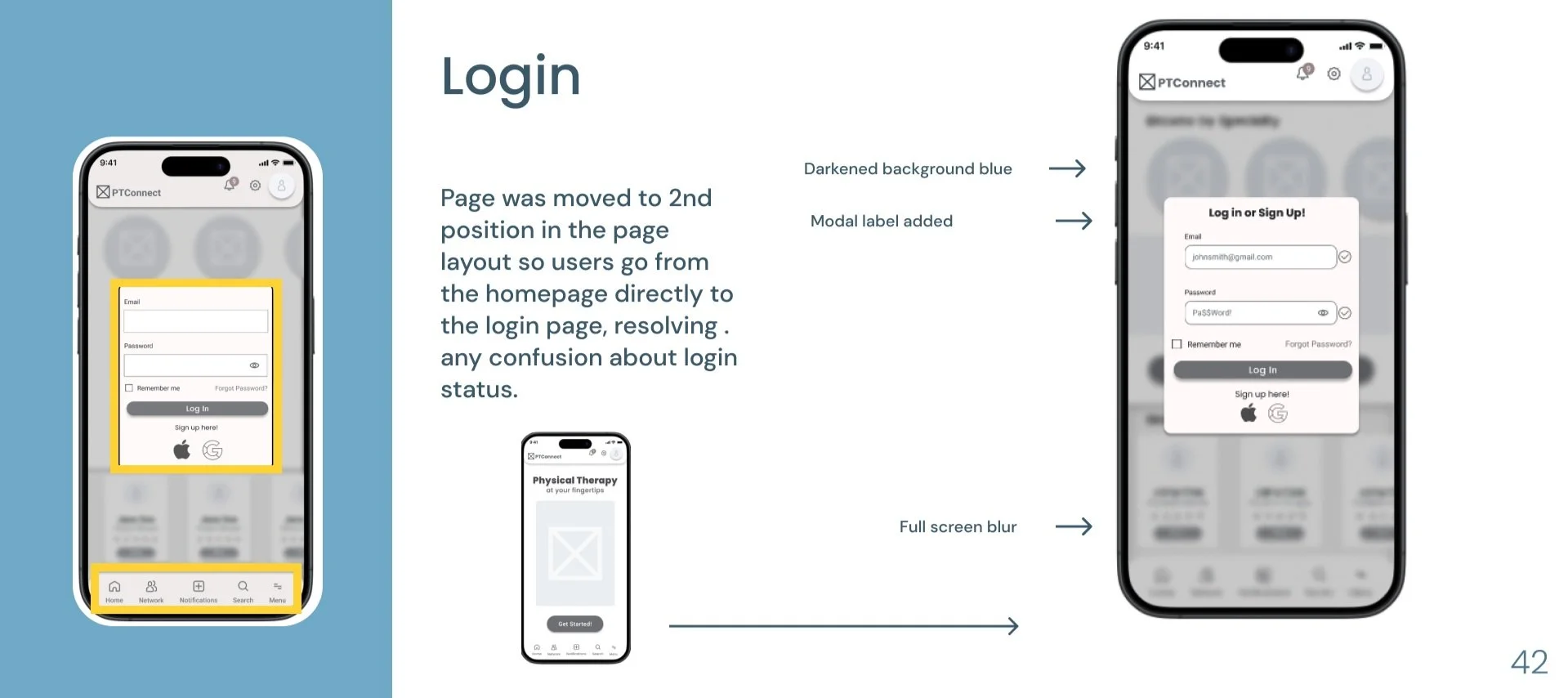
LOGIN
User Benefit:
The login system is built to provide users with flexibility, enabling them to either use their email or opt for single sign-on, allowing them to create a user profile, configure notification settings, and search for therapists.
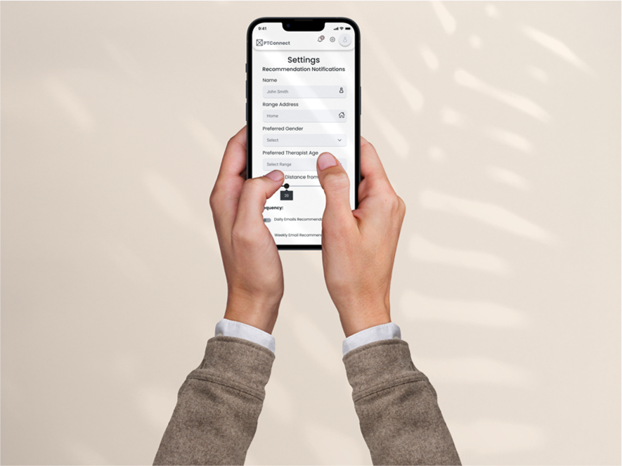
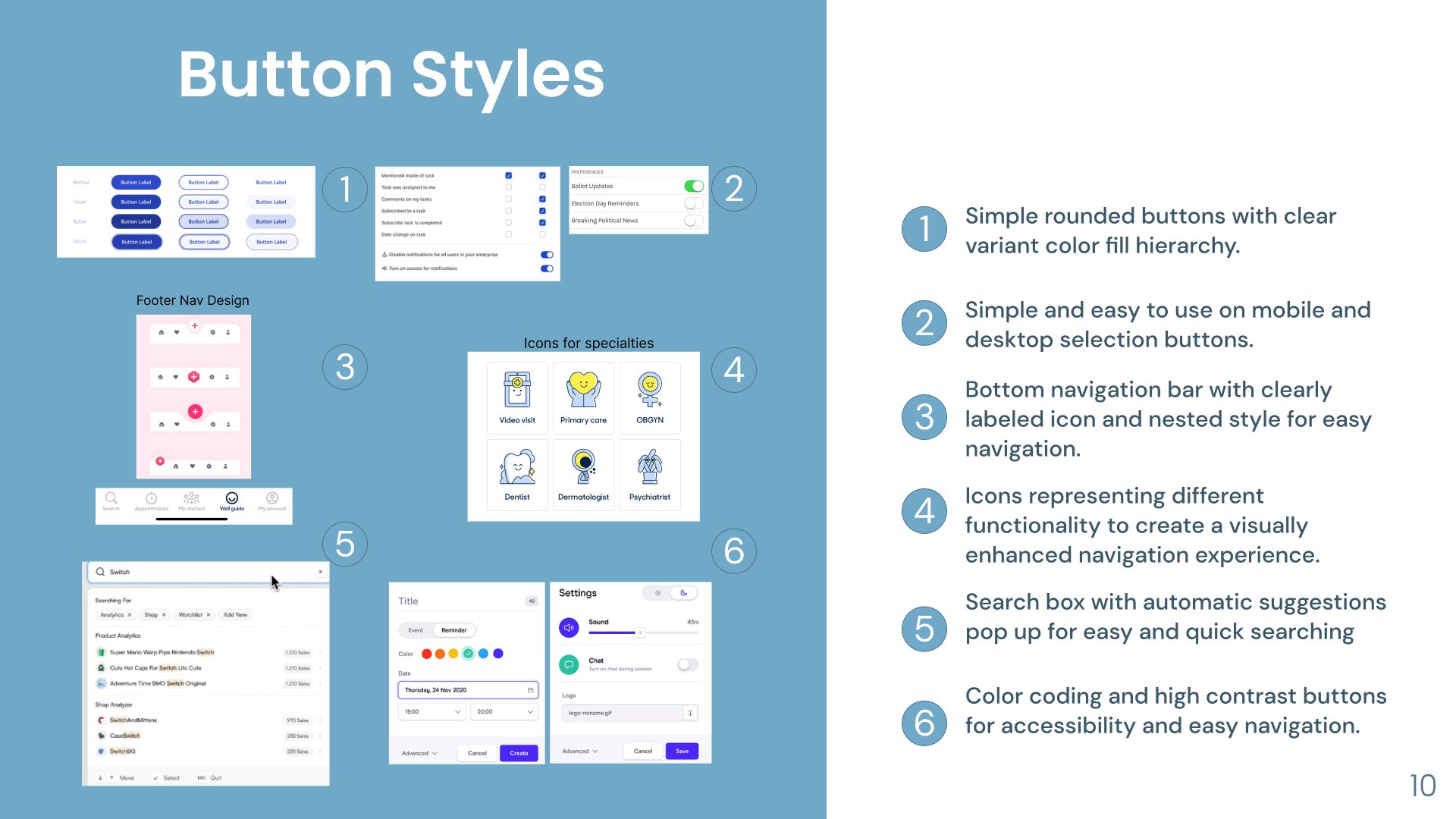
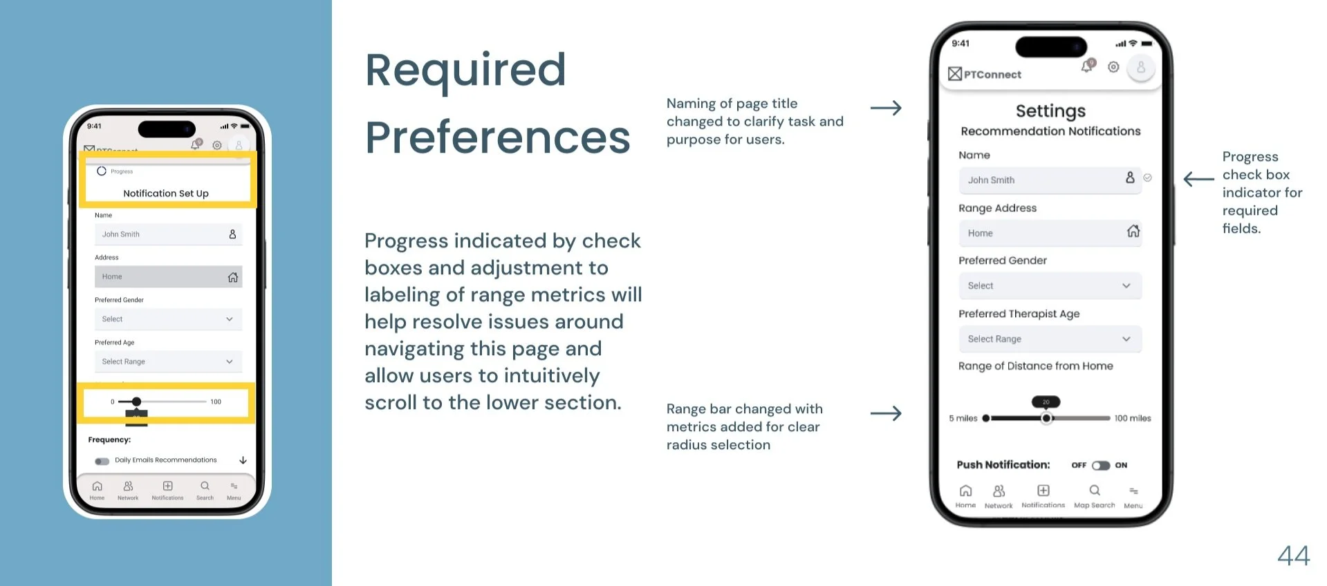
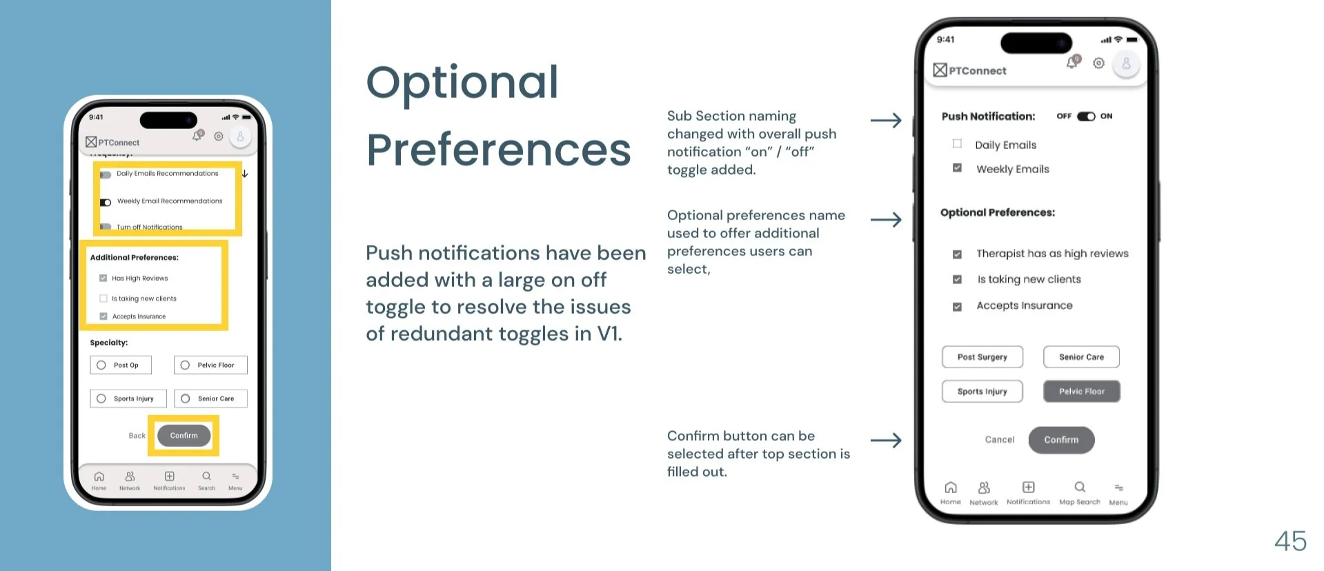
PREFERENCES
User Benefit:
The setup page employs a variety of interactive elements, including forms, sliders, checkboxes, and other controls. These features enable users to tailor their preferences and configure notification settings as they browse for therapists.
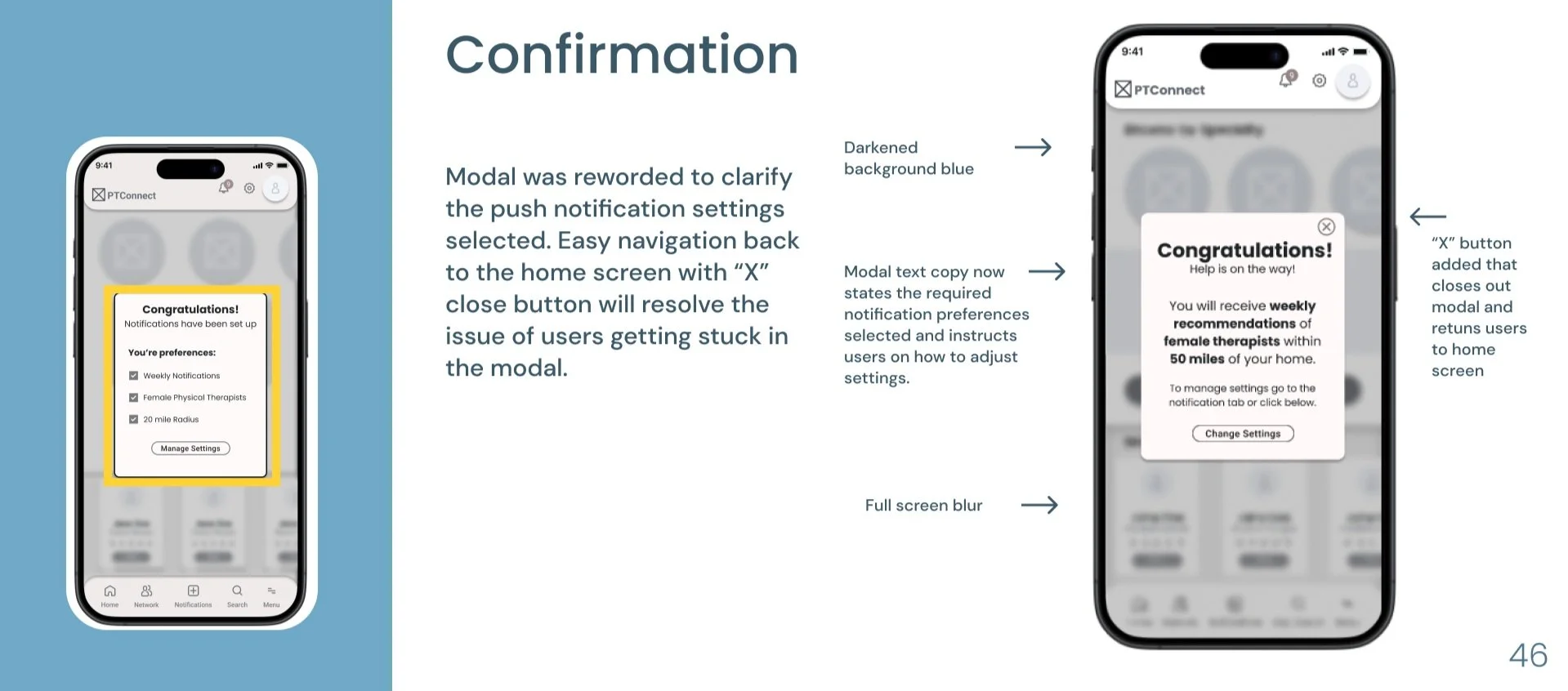
NOTIFICATION CONFIRMATION
User Benefit:
The confirmation page provides users with a summary of their selected preferences and assures them that their notification settings have been successfully configured. Additionally, it directs users to the location where they can make adjustments or enable push notifications.
STEP 4: PROTOTYPE
MID-FIDELITY WIREFRAMES
I translated my sketches into grayscale wireframes in Figma and created a working prototype. This design went through two rounds of testing, with changes being implemented after each round, resulting in 3 versions of the greyscale prototypes.
The task created in this prototype was:
Searching for a travel destination by browsing regions and filtering by equality standards.
STEP 5: TEST
Perhaps the MOST pivotal step in the UX design process is undeniably user testing. After all, how can we genuinely create something of value for users if we exclude them from the process?
I carried out user testing with five participants . All users were tasked with the same assignment:
After giving them the task prompt, I refrained from leading questions or offering hints, allowing users to explore the app organically. This approach enabled me to observe their natural navigation without external influence.
The insights obtained from user testing proved immensely valuable. Employing a priority matrix, I carefully analyzed the session output results, strategically evaluating the changes based on their perceived value to users against the effort required for implementation.
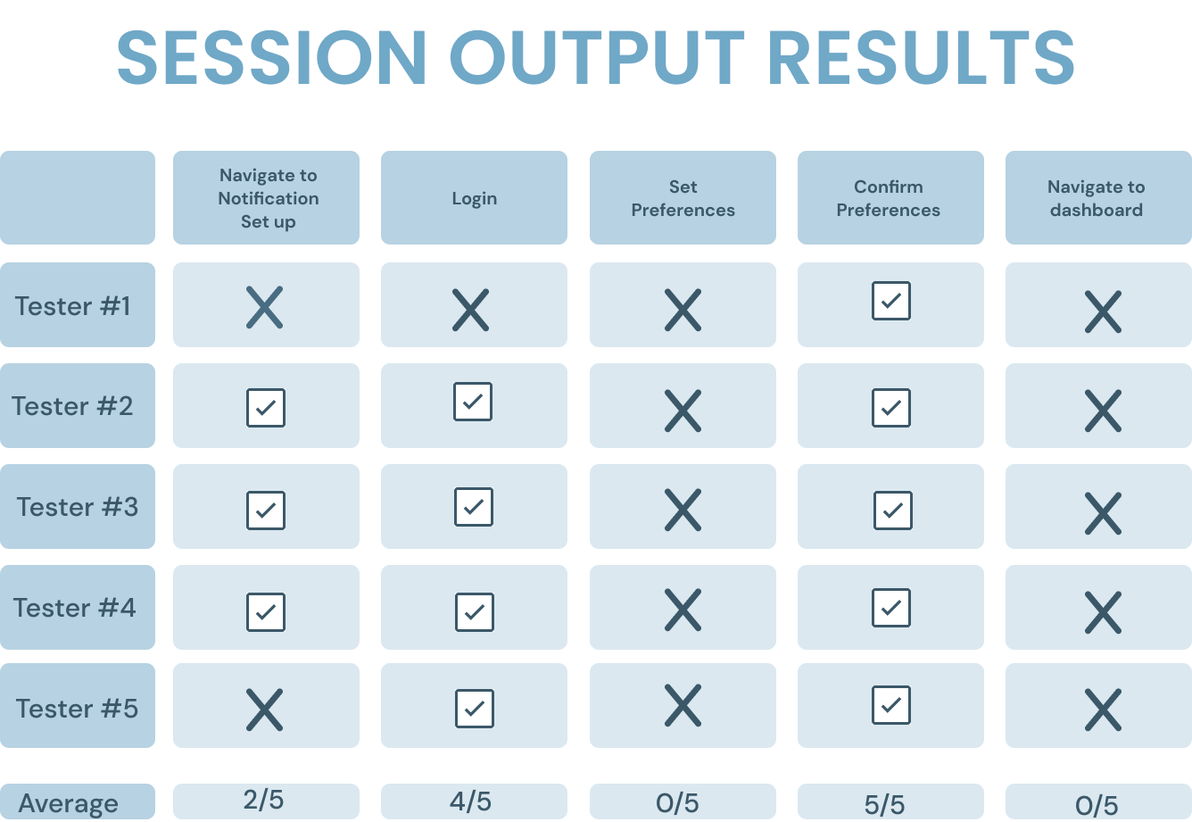
MAJOR CHANGES
FINAL MID-FIDELITY PROTOTYPE
PT Connect
MID-FI CASE STUDY
Helping Patients Find Physical Therapists