
Out & About
Out & About
A QUEER TRAVEL GUIDE IN YOUR POCKET
Traveling poses stress for everyone, but the challenge intensifies when the risk goes beyond a subpar vacation to potential emotional or physical harm. This is the reality faced by many people who identify within the LGBTQ+ community.
In this project, I focused on creating a digital solution for LGBTQ+ travelers seeking information on safety and equality for destinations around the world. My solution was a comprehensive native application where users can search and filter locations based on equality standards.
Scope: Case Study and High Fidelity Prototype
Role: UX/UI Design Strategy, UX Research, Branding
Duration: Sept 2023 - present
Tools: Figma, FigJam, Adobe Photoshop
Designed for: Apple iOS
or keep scrolling
METHODOLOGY
I used agile design thinking, grounded in extensive research and a steadfast commitment to a user-centric approach. I kept the user in mind at every step, and was not afraid to go back a step or two to make sure I was keeping in line with the core user need and value.
1. Empathize
Problem Space
Interviews
4. Prototype
Mid-fidelity Wireframes
2. Define
Persona
Experience Map
User stories/epics
5. Test
2x Rounds of Usability Testing
Prioritization Matrix
3. Ideate
Task Flow
UI inspiration
Exploratory & Solution Sketching
6. Revise
Brand Development
High-Fidelity Wireframe
STEP 1: EMPATHIZE
THE PROBLEM
Individuals within the LGBTQ+ community must prioritize their safety and well-being when planning travel. Many face challenges in obtaining comprehensive information on safety, political climate, and social dynamics, making it difficult to make well-informed decisions about whether a particular destination is suitable for them.
4 / 5
LGBTQ+ travelers feel they must consider their personal safety and well being when picking a destination.
55%
LGBTQ+ travelers from North America say they have experienced discrimination while traveling.
74%
Of travelers are more likely to seek out attractions and activities that are tailored to people identifying as LGBTQ+.
From here, I asked
How might we help North American LGBTQ+ travelers in making informed decisions about travel destinations so they can feel confident when choosing to book travel abroad?
Talking to the LGBTQ+ Community
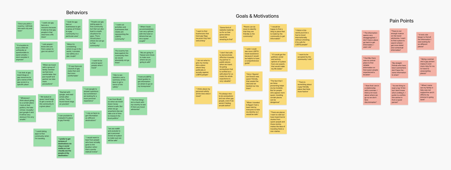
To gain deeper insights, I conducted open-ended interviews with six members of the LGBTQ+ community who had recently traveled internationally and resided in North America.
The interview questions were designed to delve into participants' behaviors, pain points, goals, and motivations within the realm of travel. The insights gathered from a combination of primary and secondary research were instrumental in crafting a persona and steering the iterative solution process.
From the interviews, I identified three themes that were consistent amongst the users.
Local Community
The majority of interviewees expressed seeking out local queer community at their chosen destination by searching for queer bars, businesses, and activities. Finding these places gave travelers a sense of security and made the experience more festive and enjoyable.
Research
The interviews made it evident that the initial and most influential phase in the travel booking process for travelers is conducting research. According to the interviewees, they often encounter frustration due to the absence of well-rounded research tools. Many participants resort to time-consuming searches on social media, vlogs, blogs, and statistical websites.
Safety
All but one interviewee stated that travel safety was the top priority when considering where to book vacations. Most stated that if there was even a question of potential danger at a destination, it would be immediately no longer considered.
CHOSEN THEME
Research
“I feel like there was no central place to find reliable information on how queer people experienced a location”
-Interviewee #2
“The information seems very disaggregated. I don't have a place go back to get information. I wish I did”
-Interviewee #6
“There is not enough nuance on the travel advisories. I want to find a place to search where I get more detail and contextual information”
-Interviewee #5
USER INTERVIEW NOTES
STEP 2: DEFINE
PERSONA
Although the research provided valuable insights for my process, it's challenging to connect with data on a personal level. Given that empathy is a central tenet of my design approach, I synthesized a persona from the collected data to personify my user. This persona became a crucial tool, enabling me to empathize with the individuals for whom I was designing the product and served as my guiding principle throughout the entire design phase.

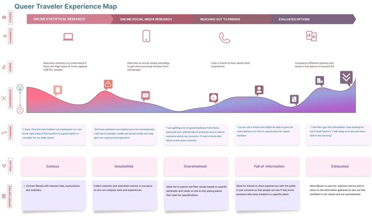
EXPERIENCE MAP
This map provides insight into Bessie's journey as she seeks information and makes decisions about her vacation destination. It highlights her pain points, objectives, and driving forces, shedding light on the challenges she faces while sifting through the vast amount of online information. Moreover, it uncovers potential opportunities to simplify and enhance her experience.
STEP 3: IDEATE
SELECTING A TASK
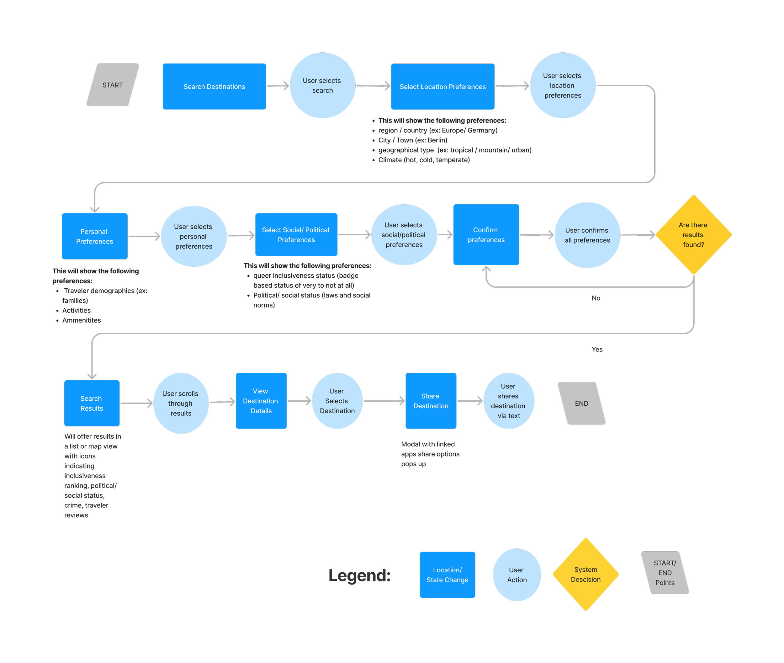
After shaping the persona, I delved into the creation of over 40 user stories. This exercise wasn't just about exploring the potential features of my app; it was a meticulous effort to ensure I was truly meeting the user's needs. My primary emphasis was on refining the destination selection process, recognizing the travelers' inclination to comprehend the social and political landscape of potential destinations before making a travel decision.
I took a thoughtful approach when it was time to zero in on my core epic. Considering the essence of my app's minimum viable product (MVP) and aligning it with my How Might We Statement, I landed on "Searching for a Destination" as the pivotal core epic. This choice laid the groundwork for constructing the task flow that followed.
CORE EPIC
Searching for a Destination
Task: Searching and filtering destination preferences and sharing result
UI INSPIRATION
VISUAL LANGUAGE
First, I gathered UI inspiration components from existing travel and search products. I looked for sleek and modern designs that had largely back and white color scheme with a splash of color.
Based on my task flow I searched components that included effective browse, search & filter, reviews and result pages with a map view option. Based on my research users wanted to be able to scan for information and also dive into a particular area of interest.
SKETCHING
I began by sketching out the different iterations of the pages by hand and I took my time to figure out which ideas matched what my users really needed. Then I translated the most promising elements into solution sketches that became the starting point for building my wireframes.
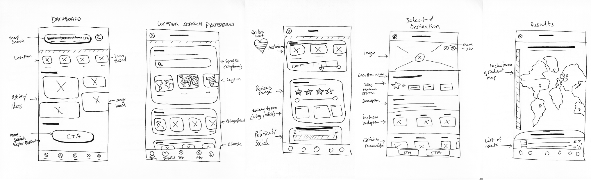
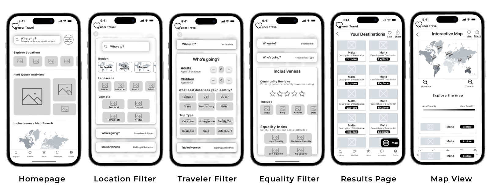
DASHBOARD
User Benefit:
Offer multiple areas of the site to navigate to through floating image and icon buttons
LOCATION FILTER
User Benefit:
Allow travelers to customize their results by location type and geographical inputs.
EQUALITY FILTER
User Benefit:
Allow travelers to customize their results by equality ratings and traveler reviews.
TRAVELER FILTER
User Benefit:
Allow travelers to enter their identity and trip purpose to further customize results.
RESULTS LIST
User Benefit:
Give travelers detailed information on each location from the perspective of traveler safety, LGBTQ equity, and local community.
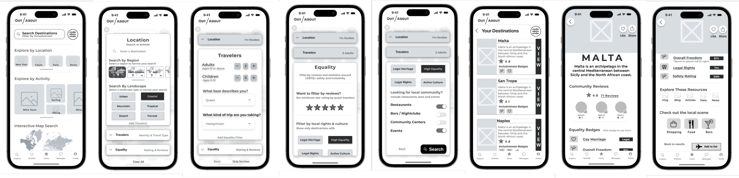
STEP 4: PROTOTYPE
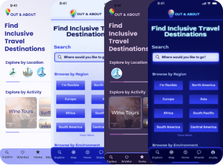
MID-FIDELITY WIREFRAMES
I translated my sketches into grayscale wireframes in Figma and created a working prototype. This design went through two rounds of testing, with changes being implemented after each round, resulting in 3 versions of the greyscale prototypes.
The task created in this prototype was:
Searching for a travel destination by browsing regions and filtering by equality standards.
STEP 5: TEST
Arguably the most crucial step in the entire UX design process is conducting user testing. After all, how can we create something truly valuable for users if we don't involve them in the process?
I carried out user testing in two rounds, with five participants in each, incorporating changes to the prototype between each round. All users were tasked with the same assignment: searching for a destination by filtering for region, travelers, and equality preferences, then sharing the destination Malta. After giving them the task prompt, I refrained from leading questions or offering hints, allowing users to explore the app organically. This approach enabled me to observe their natural navigation without external influence.
The insights obtained from user testing proved immensely valuable. Employing a priority matrix, I carefully analyzed the feedback, strategically evaluating the changes based on their perceived value to users against the effort required for implementation.
Here are the major changes implemented between versions of the grayscale wireframes.
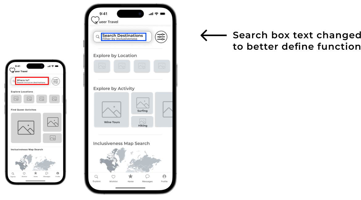
The feedback from users was that the phrase “ Where to"?” did not clearly indicate the function of searching. I relabeled the input field with words “Search Destination”" which more directly described the task required to engage with the function of the app.
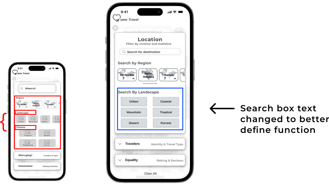
User feedback came back describing the page as too crowded and overwhelming. The separate sections of “Region” and “Climate” felt too similar and provided too much user freedom. I considered combining the sections into a single section called “Landscape” to address this feedback and redesigned the button inputs to be more visually streamlined.
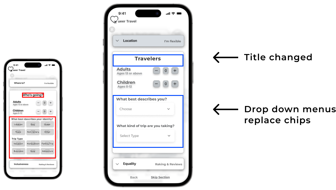
Similar to the homepage search input, users found the phrase “Who’s Going? unclear, so it was changed to a more descriptive word, “Travelers”.
Likewise, the page felt overwhelming with too many options and visually difficult to navigate. I streamlined the identity and trip type section input design to drop down menus to allow the user to add the information, while keeping the page more visually manageable.
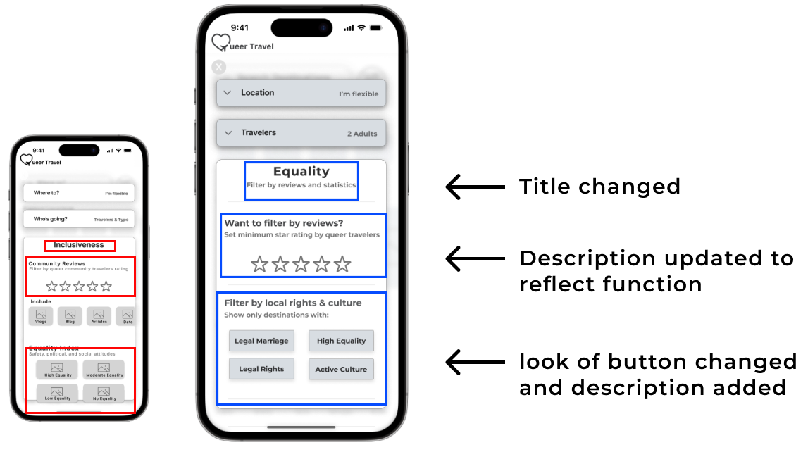
Users found this section to be a very unique feature to have on a travel search app, validating the overall value proposition of the product.
They did find the word, “Inclusiveness” to be confusing. Further illustrating how important words and labeling is to user comprehension. I adjusted the page name to “Equality” and gave a small description below it to help guide users through the preferences.
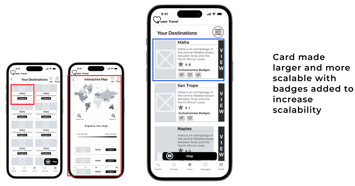
Users found the result cards too small to get a real sense of the locations, and although the interactive map (which had not been animated to be interactive at the time of the testing) was a liked feature, users often went straight from the list view to a individual location, rather than exploring the map.
I decided based on this analysis that for the purpose of adhering to the task flow, it was best to remove the interactive map and include it in the next steps.
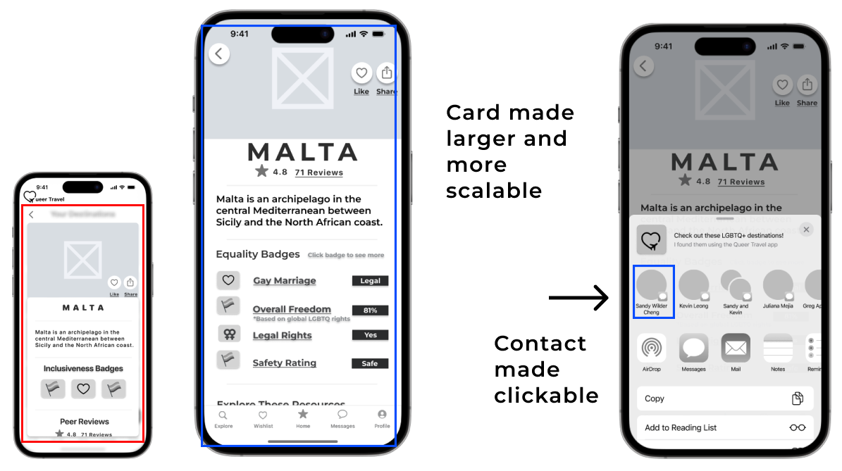
User feedback indicated that the result card text and image were too small and not easy to read. I increased the size of the image and make the card more scannable.
STEP 6: BRAND
BRAND DEVELOPMENT
Once the wireframes were locked in, I shifted gears to ponder the visual vibe of OUT & ABOUT before diving into the high-fidelity prototype.
I kicked things off by brainstorming keywords by asking myself the question; how do I want my user to feel when they are using the app?
Fun
Inclusive
Informative
Comprehensive
Accessible
Welcoming
Then I thought about a "more A than B" list. The idea was to sketch out a general vibe for the app before getting into the nitty-gritty of colors. A bunch of these "More A than B" statements took cues from the insights gathered during user interviews in the Primary Research phase.
More personal than general, but still easy to browse
More comprehensive than basic
More unique than generic, but not too different
More fun than a stressful
More easy than difficult
NAMING THE APP
Keeping in mind the keywords and overall feeling the app should evoke in the potential user, I wanted to make sure to include recognizable LGBTQ+ community words or phrases in the name. The hope was to remain on theme and deliver a memorable brandname to users, who often share information word of mouth.
I sourced from social media, chatgpt, and used peer feedback to hone in on the perfect brand name. I came up with a few viable options but ended up choosing:
OUT & ABOUT
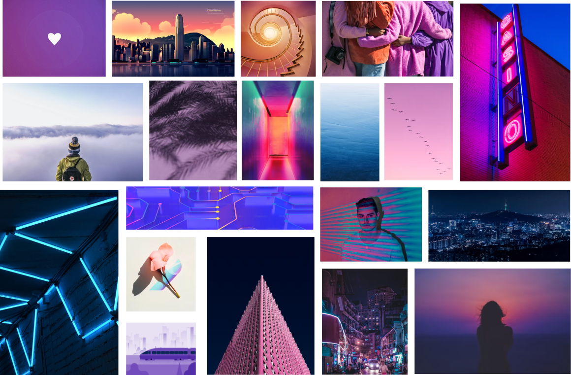
MOODBOARD
I approached the mood board process by sourcing design inspiration from photography, illustration, graphics and existing products the evoked the "“feeling” of the app. I looked for sleek and modern designs that had a largely back and white color scheme with a splash of color. The colors and layers that emerged had dark dominant shades with neon highlights.
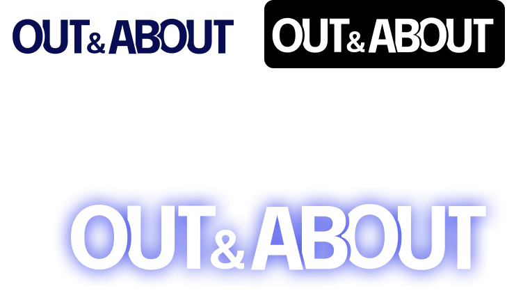
WORDMARK
I explored variations on the layout of the wordmark, incorporating travel symbols and LGBTQ rainbow symbols.
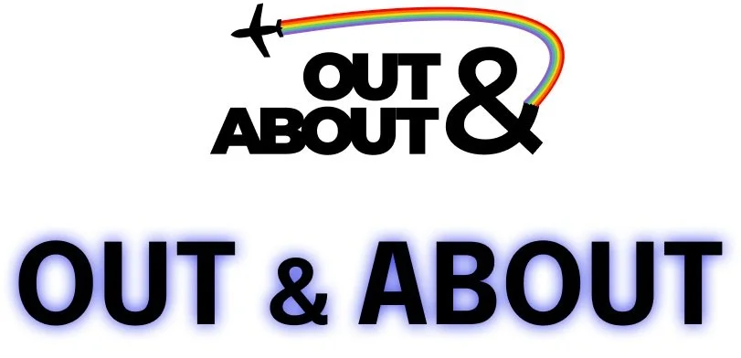
Ultimately the strength of a simple version won out over the more “design heavy” versions. I used some small cutout elements to give an elevated feel to the text and to created a condensed wordmark. Seen below on light/dark and as designed for the native app.
ICON DESIGN
I started with a more complicated design for the icon using rainbow colors and a “location” icon as the basic symbol shape but ultimately refined the design based on the goal simplification and peer feedback.
I ended up with a very friendly rainbow location symbol. The icon was added to a iOS standard app icon with the gradient background matching the app background.
COLORS
TYPOGRAPHY


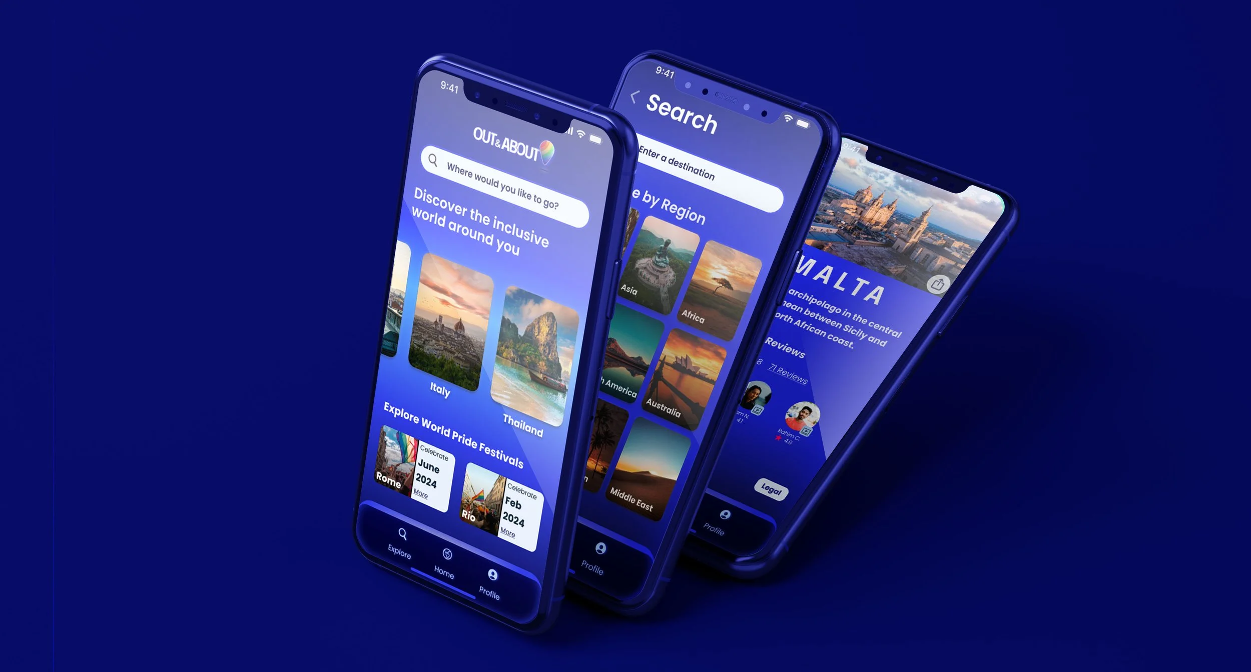
HIGH-FIDELITY PROTOTYPE
After determining the color palette, typography and branding it was time to create the final high fidelity product.
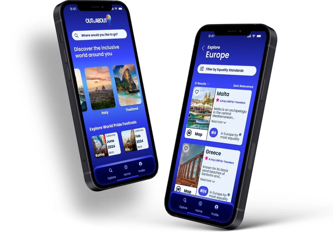
KEY FEATURES AND IMPROVEMENTS
I began the color injection process by pulling in colors from my UI board and referencing existing applications and UI inspiration. I explored various color versions of the homepage and made changes based on peer and educator feedback. However, I felt the design was lacking that something special and “cool”, for lack of a better term.
So I went back to my inspiration board to discover what that missing magic element was….
In my search, I found the missing ingredients I was craving…. What came out of this discovery was sleek but approachable, full of information and imagery, and utilized the neon blue that had first attracted me.
Most of all it helped me hone in on this notion; people don't want to read about locations, they want to SEE the location.
I rooted my final color injection in using captivating images of each location.
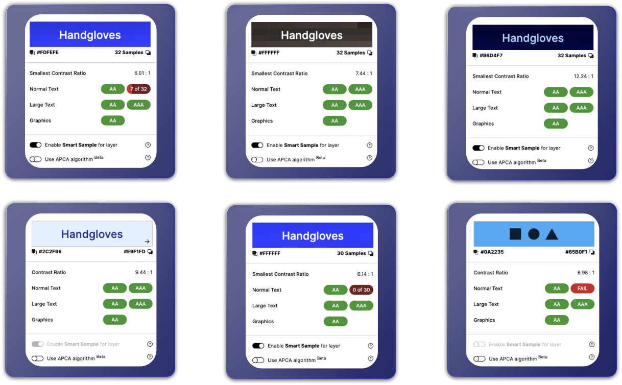
ACCESSIBILITY
Out & About meets the WCAG accessibility standards for text and icon colors with AA or AAA ratings.
This was intentionally created to make all users able to access the site with ease and comfort, keeping in line with the early keyword, accessible.
NEXT STEPS
RESPONSIVE MARKETING WEBSITE
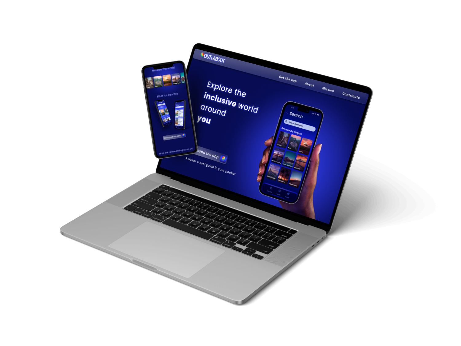
To launch OUT & ABOUT, I crafted a responsive marketing site tailored for both web and mobile platforms. The site serves as a hub to inform and captivate users about OUT & ABOUT.
Drawing from the same color palette and moodboard, I aimed for a cohesive design that gives users a preview of the OUT & ABOUT experience. The site incorporates essential elements such as key features, reviews, and a "Learn More" section to provide a comprehensive insight into the offering.
WHAT’S NEXT
OUT & ABOUT is in its early stages, and when it comes to travel planning, it has only just begun exploring the multitude of opportunities worth exploring for users. Reflecting on my user interviews and the emerging themes, there are two features that I am contemplating for the expansion of the OUT & ABOUT app.
Adding a Booking Feature
Some of the possibilities with this are allowing users to book travel directly through the app, or to inquire about lodging or events within the app ecosystem.
Partnering with LGBTQ+ Travel Businesses (Airlines/Hotels/Destinations)
OUT & ABOUT has the potential to establish strategic partnerships with various travel companies and destinations. This collaboration would enable users not only to discover ideal destinations but also access exclusive travel opportunities and noteworthy events worldwide while allowing businesses to tap into this highly valuable market of travelers.
It's crucial to highlight that both of these suggestions haven't undergone testing. Any potential expansion for OUT & ABOUT would necessitate thorough user interviews and testing to ensure their viability and effectiveness.
ADDITIONAL CONSIDERATIONS
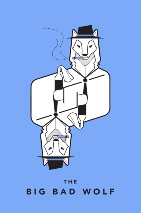
As part of a forward-thinking exercise, I drew two cards from the Tarot Cards of Tech.
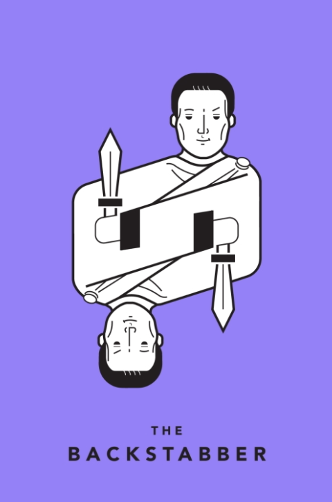
What would cause users to lose trust in OUT & ABOUT?
Out & About relies on giving accurate information about the safety and equality in any given location based on statistics and personal reviews. If that information were found to be inaccurate, or users had negative experiences regardless of its accuracy, users may find it hard to true the app.
In order to address this the app would need to make it clear in writing that it is merely providing a amalgamation of information from many sources, and users should always use their best judgement when making choices about personal safety and well-being.
What would a bad actor do with OUT & ABOUT?
Since OUT & ABOUT is an app designed for the LGBTQ+ community, users could face harassment through the app if unwanted users were able to infiltrate the app with the intention of causing harm.
As a result, the OUT & ABOUT would need to have reporting features within the app to allow users to report any abuse or harassment.
KEY LEARNINGS
Reflecting on the 10-week journey, there were abundant opportunities for growth and learning. The paramount lesson gleaned from this project was the imperative to consistently trust the users. What this means is recognizing and believing that they possess insights into their preferences and what suits them best.
Stepping into the realm of UX design, I've come to appreciate the profound significance of empathy and a collaborative mindset. Drawing from my nearly 10 years in the film industry, particularly as a film producer, where collaboration and empathy were essential for bringing diverse teams together to shape a cohesive project, I find these qualities equally, if not more, crucial in the realm of user experience design.
Furthermore, I've gained the insight that humility is vital in design. When a design falls short, it's not a reflection of my abilities, but rather an indication that it might not be meeting the user's needs effectively. Shifting focus from personal attachment to a design and redirecting energy towards understanding the user emerges as the most essential approach. This realization underscores the perpetual journey of learning within the dynamic field of design.